Toby: Infusing Playful Typography Into Modern Design Projects
Most design tools promise precision, structure, and polish. Toby offers something different. It brings the unguarded energy of a child's handwriting into digital spaces where that quality is often missing. For designers, marketers, and content creators who need to soften a brand voice or add genuine warmth to a layout, Toby fills a gap that conventional typefaces cannot reach. Understanding where it belongs in a project lifecycle and how to deploy it effectively makes the difference between whimsy that works and whimsy that distracts.
What Toby Actually Is and Why It Matters
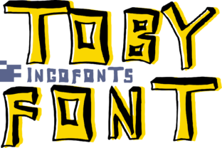
Toby is a typeface rooted in the rhythm and irregularity of how children write. Letters tilt at slightly different angles. Stroke weights vary. Spacing feels spontaneous rather than calculated. The result is not sloppy — it is expressive in a way that polished sans-serifs and formal scripts cannot replicate. When a project calls for authenticity, nostalgia, or a sense of play, Toby delivers that emotional layer without additional illustration or decorative elements.
Its value lies in contrast. Most commercial design operates within grids, alignment tools, and carefully balanced compositions. Toby introduces organic movement into those rigid frameworks. A heading set in Toby above body copy set in a clean workhorse typeface creates immediate visual tension — structure meeting spontaneity. That tension draws the eye and signals to the viewer that the content carries a human touch.
Where Toby Fits Within a Design System
Design systems thrive on consistency. Components, spacing rules, and typographic scales keep everything cohesive. Toby occupies a specific role in that ecosystem — it functions best as an accent voice rather than a primary workhorse. When the system needs to communicate announcement, celebration, or personal connection, Toby steps in. The rest of the time, it steps back.
This intentional restraint matters. Overusing a playful typeface dilutes its impact and risks making the design feel juvenile rather than charming. The strongest implementations treat Toby as a deliberate tonal shift. A financial app might use it for achievement messages. An educational platform could apply it to student-facing prompts. A boutique brand might reserve it for product names or thank-you notes within packaging.
Planning a Project Around Toby's Strengths
Before dropping Toby into a layout, it helps to define what emotional response the project needs to provoke. Playful typography works when trust, approachability, or lightheartedness supports the message. It works less effectively when authority, precision, or formality takes priority. A law firm's annual report gains nothing from whimsical letterforms. A children's clinic appointment reminder becomes warmer and less intimidating with them.
During the planning phase, identify the touchpoints where a human, informal voice adds value. These might include:
- Headlines and subheadings for blog posts, newsletters, or social media graphics that benefit from a conversational tone
- Call-to-action buttons where friendliness increases click-through rates without sacrificing clarity
- Packaging and unboxing experiences where the first physical impression sets an emotional baseline
- Digital product interfaces where microcopy paired with playful type reinforces a supportive user experience
- Event materials such as invitations, signage, and name tags that signal celebration over formality
Mapping these touchpoints early prevents random application and ensures Toby serves a consistent strategic purpose across deliverables.
Pairing Toby With Complementary Assets
Toby rarely works in isolation. Its effectiveness multiplies when supported by typefaces, colors, and imagery that ground it. A common mistake is pairing it with other highly decorative elements that compete for attention. Instead, let Toby carry the expressive weight while everything else provides a calm, supportive backdrop.
Practical pairings include neutral sans-serifs with even stroke widths — typefaces that prioritize readability and fade into the background when not directly examined. Color palettes benefit from restraint as well. Soft pastels, warm neutrals, or muted tones let the letterforms speak. High-contrast neon or aggressive gradients fight against the gentle quality Toby brings.
Imagery follows the same logic. Photography with natural light, candid expressions, or handmade textures reinforces the organic feel. Highly retouched studio shots or cold architectural photography creates discordance that undermines the intended effect.
Implementation Tactics for Different Workflows
The way Toby enters a project varies by medium and team structure. Designers working solo have different considerations than those collaborating across departments or handing off files to developers.
Print and Packaging Workflows
Print projects provide full control over how Toby renders. Since the typeface behaves predictably in static layouts, the main concerns revolve around legibility at size, ink coverage on different substrates, and how letterforms interact with die lines or folds. Testing at actual scale matters — what looks charming at 24 points on screen might feel fragile or hard to read when printed on textured paper at 12 points.
When preparing files for commercial printing, outline the type or embed it properly to avoid font substitution. Confirm that the printer's proof matches the screen rendering, especially with thinner stroke weights that might break up on certain substrates.
Digital Product and Web Integration
Web implementation introduces performance and rendering considerations. Self-hosting Toby as a web font requires attention to file formats, subsetting, and loading strategies. Serving only the character set needed for headings reduces file size. Using the font-display property in CSS ensures text remains visible during loading rather than disappearing temporarily.
Responsive design adds another layer. Toby's irregular letterforms can become harder to parse at very small sizes. Setting a minimum font-size breakpoint preserves legibility. On mobile viewports, consider increasing letter-spacing slightly to compensate for the tighter default kerning that comes with the typeface's handwritten origins.
For accessibility, maintain sufficient color contrast ratios and avoid using Toby for critical interface text like form labels, error messages, or navigation elements. Its role is decorative and tonal, not functional.
Collaborative and Client-Facing Workflows
When presenting work that includes Toby to clients or stakeholders, context shapes reception. A playful typeface shown in isolation can trigger concerns about professionalism. Showing it within a complete composition — paired with the supporting type system, applied to real copy, and surrounded by the full visual language — frames it as an intentional choice rather than a frivolous one.
Documenting the rationale helps. A brief note explaining that Toby humanizes a specific customer touchpoint or reinforces brand personality gives decision-makers language to support the direction. This is especially useful in organizations where multiple approvers weigh in on creative work.
Quality Control and Consistency Over Time
The organic nature of Toby creates a specific quality control challenge: it can look inconsistent if applied haphazardly. Establishing simple guidelines prevents drift. These might include:
- Defining permitted uses — headline levels, specific components, or particular content categories where Toby is approved
- Setting size ranges — minimum and maximum point sizes or pixel values that maintain legibility and impact
- Specifying tracking and leading adjustments — slight increases to letter-spacing or line-height that optimize readability for the typeface's unique proportions
- Creating templates or presets — saved styles in design software or coded component classes that team members can apply without manual configuration
Small teams might manage this through a shared style guide or design system documentation. Larger organizations benefit from locking approved styles into component libraries where deviation requires deliberate effort.
Measuring Effectiveness and Iterating
Unlike purely decorative choices, typography influences behavior. Toby's impact can be observed through engagement metrics, user feedback, or qualitative testing. An email subject line or social graphic set in Toby might generate higher open or interaction rates not because the content changed but because the presentation felt more personal. A landing page headline might reduce bounce rates because visitors feel welcomed rather than sold to.
Testing variations clarifies what works. Try the same message in Toby versus a standard sans-serif and compare performance. Gather feedback from actual users or customers rather than relying on internal preferences. The goal is not to prove Toby works everywhere but to understand where it adds measurable value so future projects benefit from accumulated insight.
Long-Term Considerations for Growing Projects
As a brand or product evolves, the role of a distinctive typeface like Toby may need to adapt. What starts as a charming accent for a small shop's packaging might need to scale across a national campaign or a multi-language product interface. Planning for that possibility early reduces friction later.
Check whether Toby's character set supports the languages and special characters the project might eventually need. Confirm that licensing terms cover intended uses — print, web, app embedding, or broadcast. If the typeface is custom or exclusive, maintain relationship continuity with the foundry or designer in case updates or expansions become necessary.
Most importantly, revisit the decision periodically. A typeface that felt fresh and delightful at launch can feel dated or off-brand after a strategic pivot. Building review cycles into the design process ensures Toby remains a deliberate, effective choice rather than an inherited default.
Bringing Toby Into Your Own Work
Start small. Pick one project or one touchpoint where warmth and playfulness align with the objective. Apply Toby to a single headline, a social media template, or a product badge. Observe how it changes the tone. Pay attention to the reactions it generates — from colleagues, from customers, from your own gut response when you see the work in context.
Resist the urge to use it everywhere. Restraint preserves its charm. Over time, you will develop an instinct for when Toby fits and when a more conventional choice serves the work better. That discernment is what separates designers who use playful type effectively from those who simply decorate with it.
Toby is not a universal solution, and it was never meant to be. It is a specific tool for specific moments — the moments when a project needs to feel less like a polished product and more like a note from someone who genuinely cares. Those moments matter more than many design processes acknowledge. Having Toby ready for them means you can respond with the right tone when the opportunity arrives.